2023
NRS
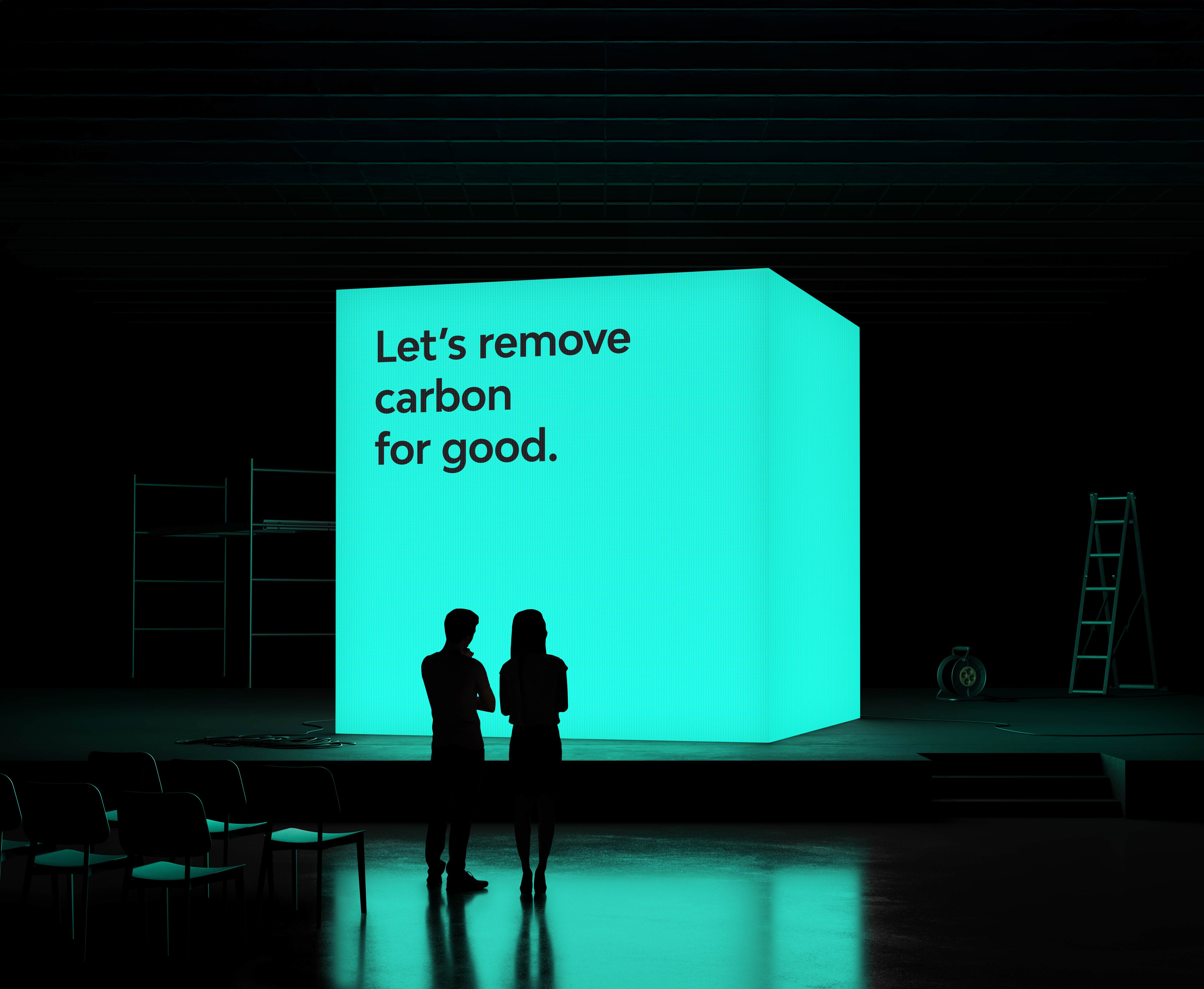
Renewable energy company, Drax launched a new product offering
to their US market.
Branding
Logo Design
Know More
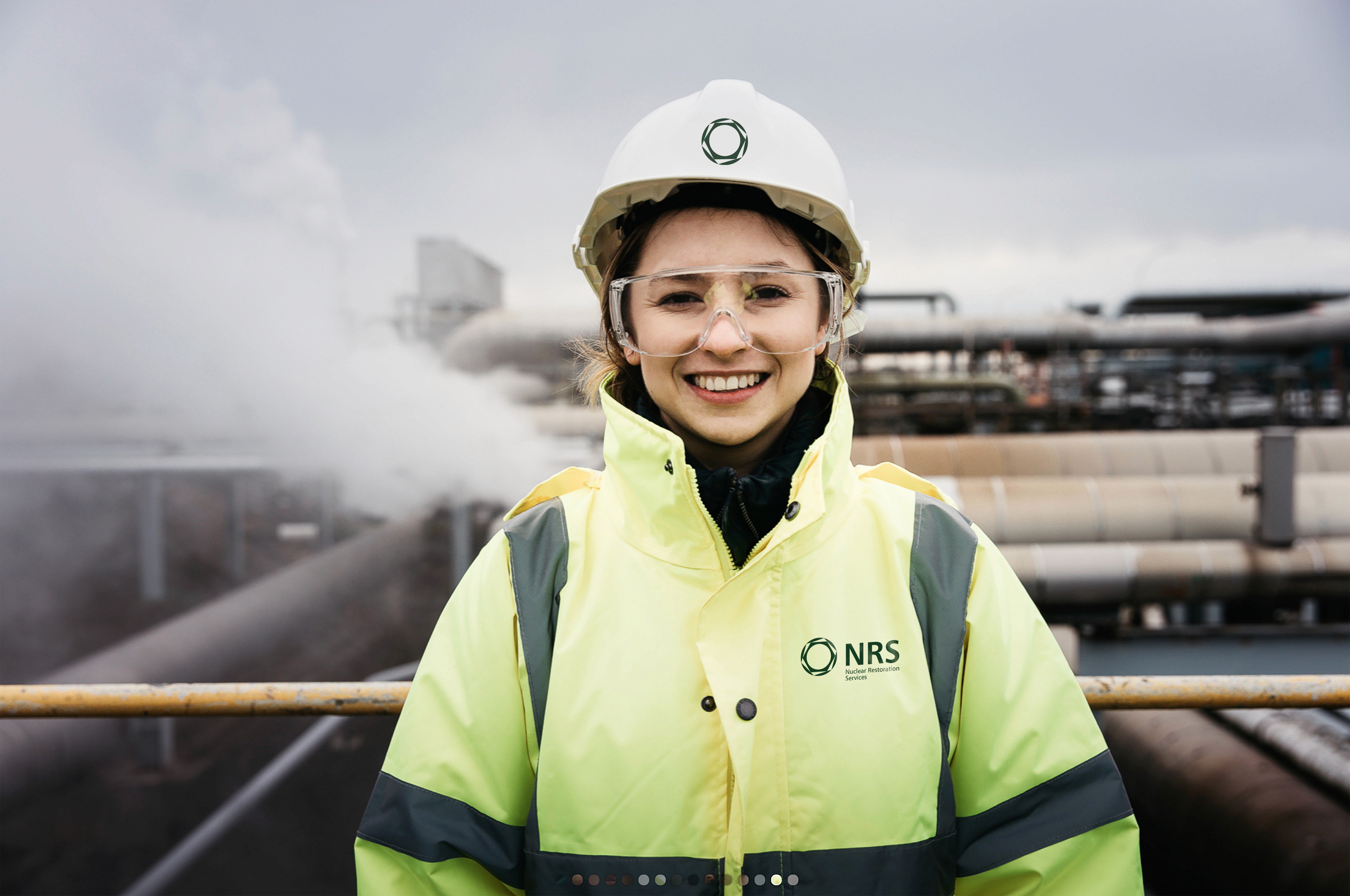
Nuclear Restoration Services (NRS) needed a brand to unite the UK’s nuclear decommissioning sites under one name. I created a modern identity that inspired employees, signalled change, and set the stage for a safer future.

Problem
Problem
Previously operating as Magnox, the organisation faced an image problem: years of fragmented ownership had left employees demotivated and disconnected.
The existing Magnox brand felt outdated, corporate, and uninspiring. Staff morale across sites was low, and there was little consistency in how the organisation presented itself publicly. Leadership knew that with a major government grant in hand and a vital role in the UK’s energy transition, they needed a unifying brand identity that would engage employees, win stakeholder trust, and signal a positive step forward.

Solution
Solution
I explored a wide range of brand concepts before landing on the new NRS identity, which was bold, approachable, and inspired by nature and science.
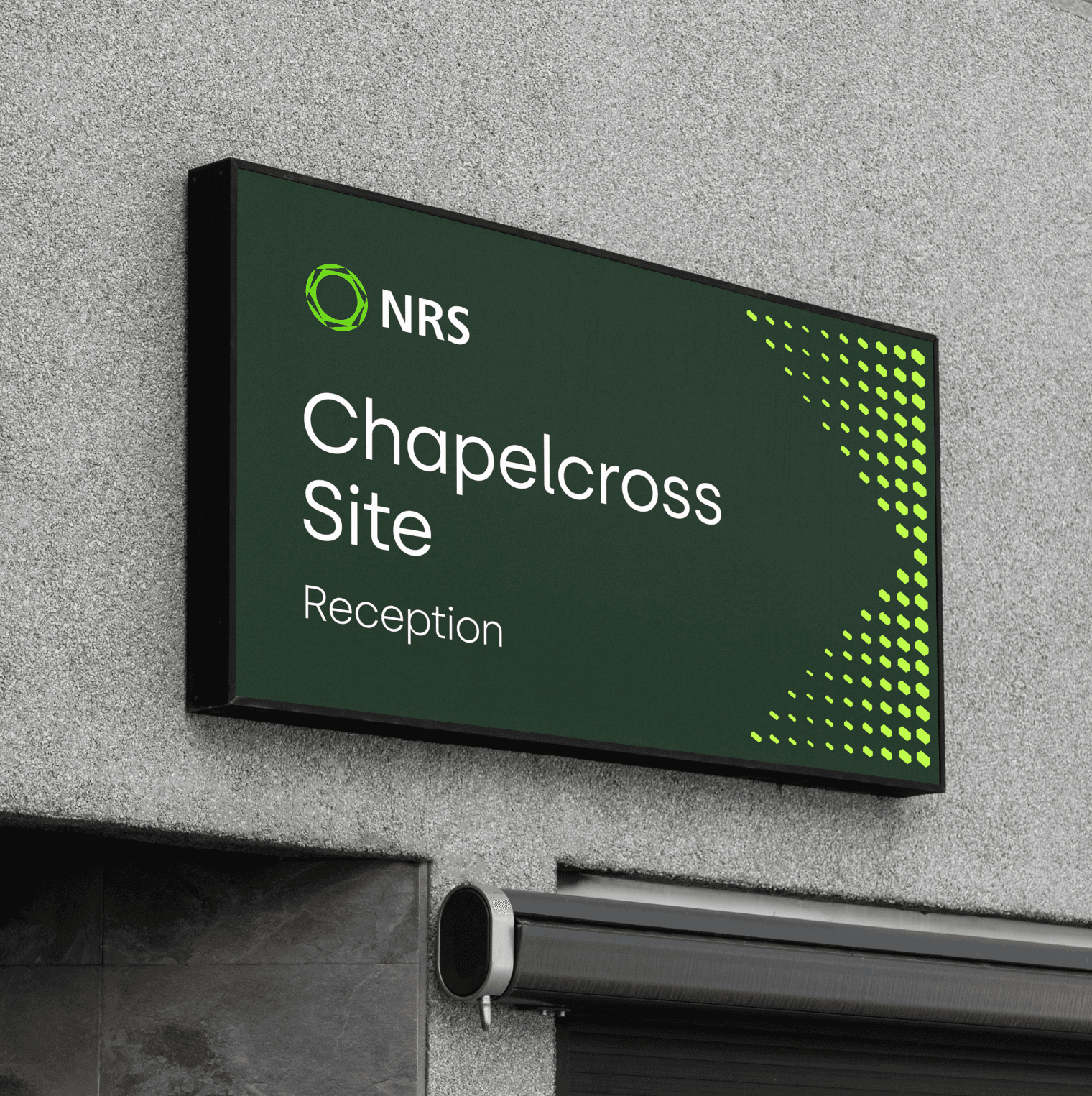
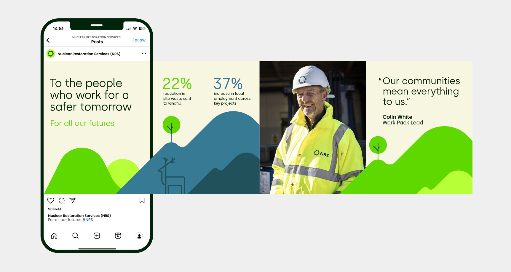
A palette of fresh greens and illustrative landscapes symbolised the transformation of nuclear sites into safe community spaces, while a distinctive hexagonal device reflected both the core structure of nuclear fission reactors and the natural efficiency of beehives. This gave the brand a unique graphic language that connected technical expertise with sustainability. The identity was anchored by the strapline “For all our futures”, reinforcing the organisation’s long-term purpose.
Working closely with stakeholders, I produced a comprehensive set of brand guidelines and a rollout kit that covered social assets, event signage, apparel, wayfinding, and digital templates. The iterative and collaborative process helped ensure buy-in from even the most change-resistant legacy stakeholders, while the brand’s values of pride, care, innovation, and collaboration informed how it would be expressed across every touchpoint.

Results
Results
The rebrand gave NRS a modern and approachable identity that energised its workforce and provided clarity for its mission.
The toolkit allowed the brand to be consistently rolled out across every channel, from digital campaigns to on-site signage, creating a sense of unity across all locations. Internally, the fresh identity helped employees feel part of something bigger, while externally it positioned NRS as a forward-looking organisation committed to safe and sustainable change, delivering on its promise of working “for all our futures”.
More Works
More Works
2023
NRS
Renewable energy company, Drax launched a new product offering
to their US market.
Branding
Logo Design
Know More
Nuclear Restoration Services (NRS) needed a brand to unite the UK’s nuclear decommissioning sites under one name. I created a modern identity that inspired employees, signalled change, and set the stage for a safer future.
Problem
Previously operating as Magnox, the organisation faced an image problem: years of fragmented ownership had left employees demotivated and disconnected.
The existing Magnox brand felt outdated, corporate, and uninspiring. Staff morale across sites was low, and there was little consistency in how the organisation presented itself publicly. Leadership knew that with a major government grant in hand and a vital role in the UK’s energy transition, they needed a unifying brand identity that would engage employees, win stakeholder trust, and signal a positive step forward.
Solution
I explored a wide range of brand concepts before landing on the new NRS identity, which was bold, approachable, and inspired by nature and science.
A palette of fresh greens and illustrative landscapes symbolised the transformation of nuclear sites into safe community spaces, while a distinctive hexagonal device reflected both the core structure of nuclear fission reactors and the natural efficiency of beehives. This gave the brand a unique graphic language that connected technical expertise with sustainability. The identity was anchored by the strapline “For all our futures”, reinforcing the organisation’s long-term purpose.
Working closely with stakeholders, I produced a comprehensive set of brand guidelines and a rollout kit that covered social assets, event signage, apparel, wayfinding, and digital templates. The iterative and collaborative process helped ensure buy-in from even the most change-resistant legacy stakeholders, while the brand’s values of pride, care, innovation, and collaboration informed how it would be expressed across every touchpoint.
Results
The rebrand gave NRS a modern and approachable identity that energised its workforce and provided clarity for its mission.
The toolkit allowed the brand to be consistently rolled out across every channel, from digital campaigns to on-site signage, creating a sense of unity across all locations. Internally, the fresh identity helped employees feel part of something bigger, while externally it positioned NRS as a forward-looking organisation committed to safe and sustainable change, delivering on its promise of working “for all our futures”.
More Works